A Formal Affair: Black and White Watercolor Wedding Invitations

BW_watercolor_6073This suite turns the traditional black and white wedding invitation on its head. Reversing the formal script and classic typography to white on an abstract black and gray watercolor background creates a stand-out piece that is both elegant and alluring.BW_watercolor_6094

BW_watercolor_6079

Pair this suite with a white or cream envelope to keep things neutral, or add an accent color like this stunning cobalt blue. Either way, you can’t get more chic than these!BW_watercolor_6074

Shannon O’Neil Photography Stationery

Mr_and_Mrs_1193

A few weeks ago, I had the distinct pleasure of printing beautiful stationery for an East coast photographer. Shannon reached out after seeing my Mr. and Mrs. card at Laurel Grove. She said the cards fit perfectly with her own branding, and after checking out her website, I couldn’t help but agree!

shannon_5272

The process was simple: Shannon sent me her logo—a gorgeous hand-lettered, simple design that I knew would create a beautiful impression when printed with letterpress—I sent her a proof, and she said ok! We talked about a few different envelope colors before settling on a light gray, and then I ordered all the supplies! They arrived a few weeks later, I printed with great success and now they’re happily in the hands of the photographer, ready to be sent off to her lucky clients!

shannon_5285

Want some custom note cards or other stationery of your own? Get in touch!

Save

Save

Save

Save the Date: Abi & Spencer’s Art Nouveau Wedding

Abi_Spencer_0179

Just before the holidays, I finished up a save the date card for the boyfriend’s sister. Abi and her fiancé are planning an Art Nouveau themed soirée this fall and wanted their invitation suite to give guests a peek at what’s to come.

Once I saw Abi’s Pinterest board—full of soft candlelight, sparkling chandeliers, swirling illustrations and hues of cobalt and gold, I knew I had to use this amazing shimmery paper I had experimented with a few weeks prior. I love that while it definitely reads gold, the paper is actually more of a champagne hue, free of the brassy or yellow hues that can make gold look cheap.

I created a two-color design inspired by motifs of the era: vaguely nature-inspired, but stylized into pure decoration. The white ink I used to print it plays beautifully off the iridescent paper.

I struggled quite a lot with the typefaces for this project, primarily because I don’t particularly like fonts from this era. I offered several more modern options that fit with with the design motif, but in the end, Abi and Spencer preferred typography that was historically accurate, and I was able to find several typefaces that I liked and worked well together!

I’m so pleased with how the save the dates turned out and can’t wait to get started on their invites, stay tuned!

Fill In the Blank

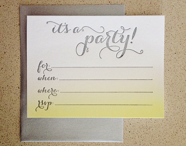
ombre_watercolor_5341While I’ve spent hundreds of hours over the years designing and producing custom invitation suites for weddings and parties, I realize not every event has the budget or timeline necessary for bespoke invites.

However, I believe more casual events deserve special stationery too, so I created the first several designs in a new line of fill-in invitations. Perfect for a dinner party, kids’ birthday, or casual shower, these flat letterpress invitations feature space to write in the details and are available in five designs—with more to come.

blue_spots_5589readymade_invite_ombre_watercolor_5346My two favorite designs (above) incorporate extra-special handmade elements. One features a hand-painted watercolor ombre background, while the other’s polka dots were carved by hand before being letterpress printed in baby blue ink. (And the latter has matching coasters available as well!)

These and more—bikes, daisies, lace—available in the shop!

daisies_5600 yellow_bike_5598