Letterpress Card Sale!

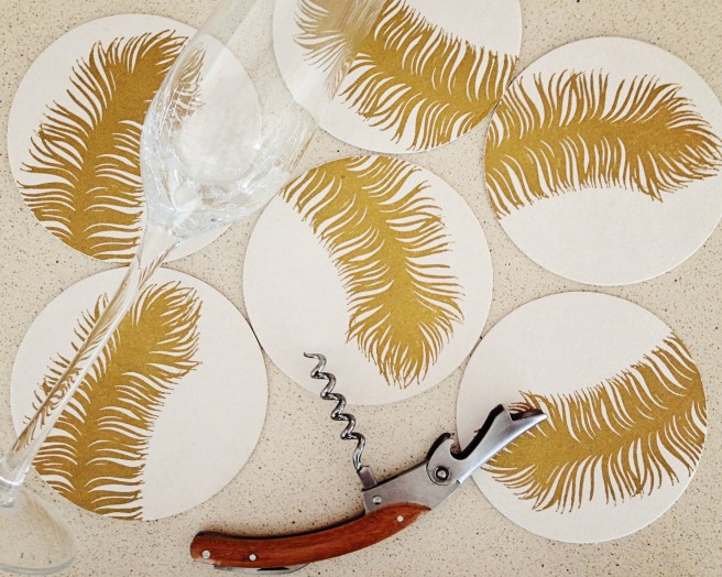
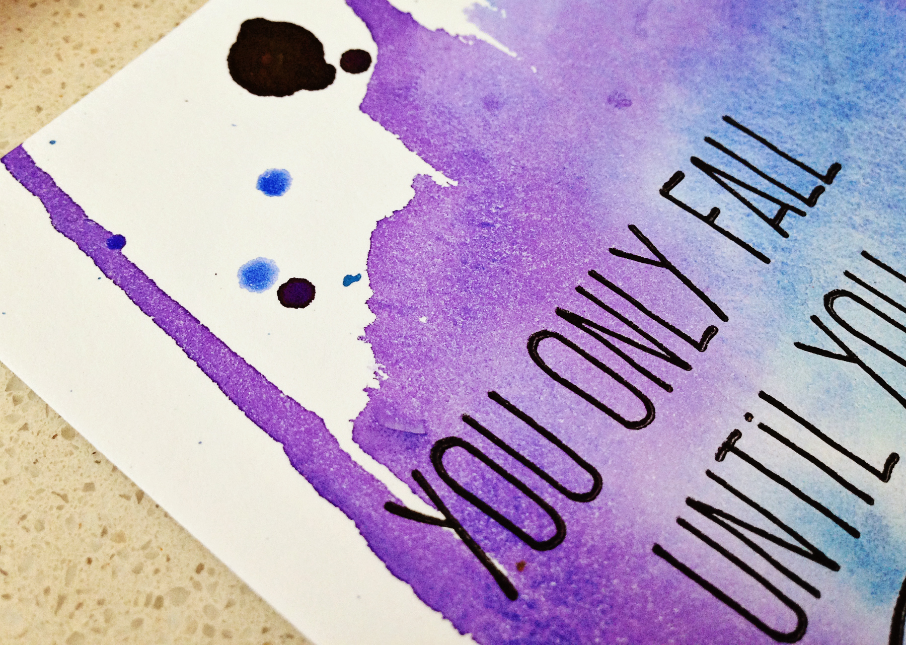
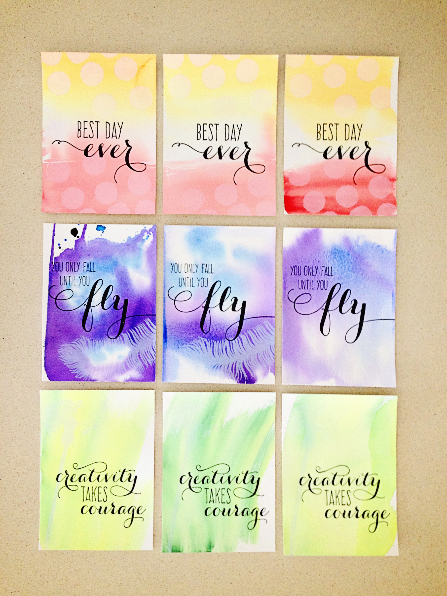
You guys, I’m so excited. I finally took the plunge and switched from the magnesium and wood plates I’ve used for years to photopolymer plates from one of the biggest producers in the U.S. I say “finally” because it’s been a long time coming—not only have the quality and customer service declined at my old platemaker, but I’m looking forward to better print quality and registration as well with this new system. For a few years now, I’ve watched what other printers can do with photopolymer with amazement, and I’m so excited to be part of the club! And the icing on the cake? Shipping and production costs are a bit less, so I won’t have to raise my prices again right away this year. Win-win-win!

COTM_515_6531

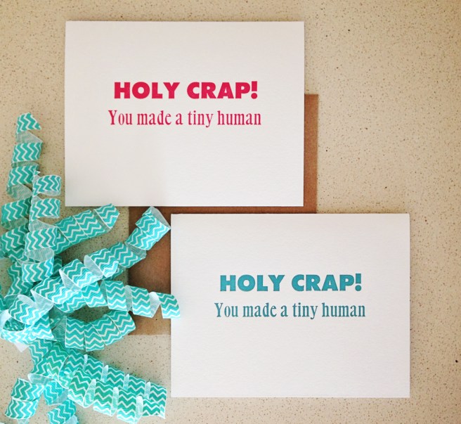
I created a handful of new designs to learn the new system with, and I’m planning for a big order of new work this summer, so to make room for all these new designs, I’m trying to clear out a few older ones. I’ve moved a ton of merchandise to the SALE SECTION in my shop, so make sure to go check it out! I won’t be reprinting any of those designs soon, so if there’s one you love, make sure to stock up!

card-club-4

New Retailer: The Waxwing

wax4

I’m super excited to announce 622 Press goods are now available at The Waxwing in Milwaukee! I’ve been wanting to get into MKE for years now, but hadn’t found the right fit—until now! The Waxwing is just my style: an eclectic mix of local and international artists and makers curated into a one-stop shop for any occasion, including when you just need to treat yourself!

gold_feather_5922 wax2

Owner Steph carries art and paper goods as well as clothing, housewares and more! She’s carrying my wood type “hello” cards in exclusive colors, along with a few of my favorite designs for any occasion! Stop by E. North Avenue to see them all!hello_multi_1563

wax5

holycrap_pink_blue_8725

A Summer’s Day

COTM_815_7953I sent August’s Card Club subscription early to make sure it left Bermuda before Cup Match week since the whole island is in vacation mode well before the actual holiday.

There was no real theme this month aside from pulling cards in my favorite late summer colors of turquoise, poppy red, oranges and gold. This lucky subscriber also received the very last “Life is a series of moments” card in stock, and the very first sparkle “congratulations” card in this color scheme. Lucky her!

As always, to get in on the action, simply shoot me an email or purchase a subscription here. The next installment will be packed up early as well, so sign up today!

May Snail Mail

I’ve done Card of the Month clubs in the past, and they were always kind of a pain, going to the post office that much. In my new life, it turns out it’s kind of great! I’m at the post office all the time anyway (plus it’s super close to our house), and sending a package every month makes me realize how quickly time is flying by.

One year ago, I was getting ready to tell the owners of my company that I was moving to Bermuda, hoping they would keep me on in some capacity, but not having any idea how that would go. Two years ago, I was on a whirlwind trip to Costa Rica with one of my dearest friends, both of us doing a little soul searching. Three years ago I was finally feeling settled in a new place, in love and happy… the year before that I was in the midst of an ugly, draining divorce. Life is crazy huh?

Anyway, the point of this post was really just to share the fun stuff I sent out in May’s Card Club! I went with a bit of a floral theme because, you know, April showers bring May flowers…. Remember, you can sign up here, or just send me an email.

COTM_515_6531

Limited edition watercolor & letterpress prints

Lately I’ve been feeling artsy with a capital A. I think it’s a reaction to the heavy production cycle I just finished, but I’ve had the urge to get my hands dirty for a few weeks now.

I’ve also been experimenting with creating limited edition prints with some of the new printing plates I created for the new collection (catch it here if you haven’t seen it yet!). I had sketched out the overall design of each print, I just couldn’t seem to find the right color combination to make them jive. I actually printed a few in silver and a few in gold, but didn’t love them… and then I had the idea to keep the ink neutral (black and white) and use bright watercolor washes for the backgrounds!

quotes_5502quotes_5503

The white ink ended up being a little more transparent than I expected, but I still really love the results. And I love how each one is absolutely unique—the cross between painting and print really speaks to me right now. quotes_5501

I printed 14 of each design and they’re available as a set of three in the shop—enjoy!