Spring Cleaning SALE!

I’ve been on a cleaning and organizing kick lately. I’ve got one little corner of my studio to go and then my entire work space will be de-cluttered, de-stashed and all the dust bunnies and tiny spiders will be chased out of their homes.

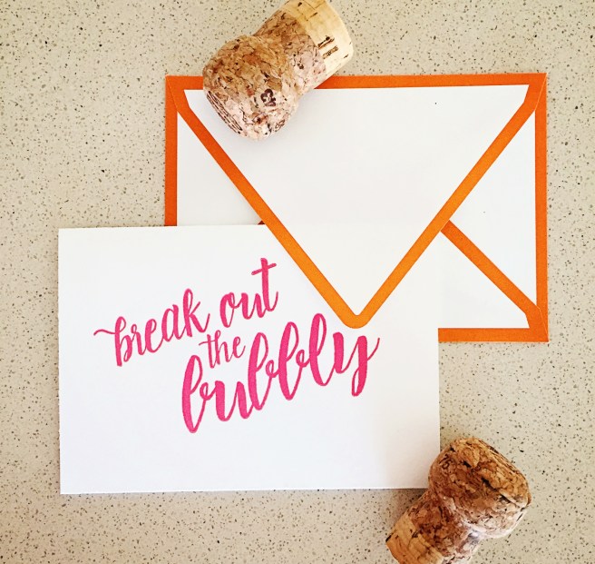
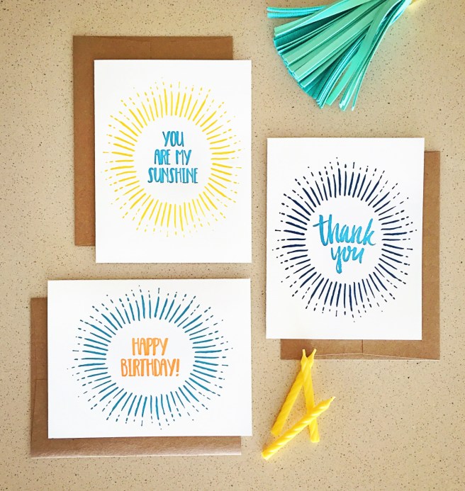
Since printing up the new collection, my in-stock inventory is overflowing a bit, which really works out for you guys, because I’m having a spring cleaning sale! Through the end of May, all card orders of three or more get one additional card free! Choose the card you’d like by including a note to seller at check out, or I’ll just double up on one of the designs you’ve already chosen. Happy shopping!

Save the Date Season

It’s that time of year, you guys. The days are getting shorter, there’s a chill in the air, and couples getting married next year are hustling to get their save the dates in the mail before holiday cards start rolling in!

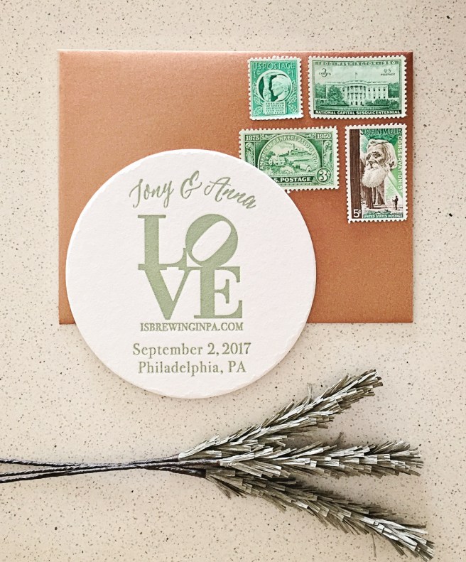
anna_tony_8030

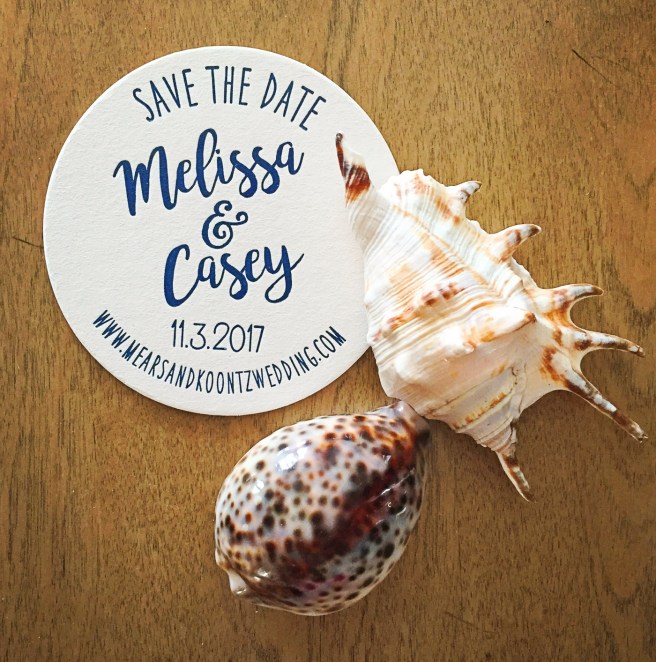
Save the date coasters are as popular as ever this year, and here are two of my favorites! I love that both Melissa and Anna had a clear idea of their design direction and kept it clean with minimal text. melissa_std_8433

I also designed some new watercolor save the dates featuring a photo of the happy couple! I’ll wait to reveal the design they chose until their friends and family have received them in the mail, but these two alternate designs are both available in the shop!

blush_watercolor_std_8042 brush_lettering_std_8036

Burgundy & Blush Watercolor Floral Wedding Invitations

blush, burgundy, wedding, wedding invitation, wedding invite, invitation, invite, watercolor, handpainted, floral, flowers, calligraphy, modern, simple, affordable, affordable wedding invitation, romantic, romantic wedding invitation, invitation suite, flat lay, invitation styling, paper flowers

Well friends, we’re at the end of my month of weddings and I’ve saved the best for last!

burgundy_floral_7216Remember Krista and Chris’ gorgeous letterpress wedding invitations from earlier this year? After the big day, I reached out to their photographer, Sara Smile about sharing a few of the gorgeous photos (which she did, so stay tuned!).

She also mentioned a romantic Brothers Grimm-themed fairy tale styled wedding photo shoot she was working on. After checking out her inspiration board, I offered to design stationery for the shoot—and my new favorite invitations were born!

burgundy_floral_7223

I started by breaking out the watercolors to paint deep burgundy peonies, mauve anemones and snapdragons, and the palest blush poppies, along with sticks and leaves to fill out the arrangements. They might be my favorite illustrations I’ve created so far!

I’ve been wanting to create a looser typography design and I thought this would be the perfect opportunity! I love this new calligraphic typeface, it’s almost as beautiful as Kelsey Malie’s beautiful envelope calligraphy!

burgundy_floral_7218

burgundy_envelope_7207

Speaking of envelopes, did you spot these custom-lined envelopes? This is the first time I’ve ordered them and they are AMAZING! They’ll be another a la carte option in my shop, but in the mean time feel free to get in touch for custom envelopes!

Order these invites in my etsy shop and stay tuned for the stunning photos from Sara’s shoot!

Save the Date: Abi & Spencer’s Art Nouveau Wedding

Abi_Spencer_0179

Just before the holidays, I finished up a save the date card for the boyfriend’s sister. Abi and her fiancé are planning an Art Nouveau themed soirée this fall and wanted their invitation suite to give guests a peek at what’s to come.

Once I saw Abi’s Pinterest board—full of soft candlelight, sparkling chandeliers, swirling illustrations and hues of cobalt and gold, I knew I had to use this amazing shimmery paper I had experimented with a few weeks prior. I love that while it definitely reads gold, the paper is actually more of a champagne hue, free of the brassy or yellow hues that can make gold look cheap.

I created a two-color design inspired by motifs of the era: vaguely nature-inspired, but stylized into pure decoration. The white ink I used to print it plays beautifully off the iridescent paper.

I struggled quite a lot with the typefaces for this project, primarily because I don’t particularly like fonts from this era. I offered several more modern options that fit with with the design motif, but in the end, Abi and Spencer preferred typography that was historically accurate, and I was able to find several typefaces that I liked and worked well together!

I’m so pleased with how the save the dates turned out and can’t wait to get started on their invites, stay tuned!

New Year’s Business Resolutions

Each January, there seems to be a surge in new business card clients, mostly small business owners or freelancers looking to finally get some professional business cards made. It’s one of my favorite influxes—such a fun way to kick start the year—and this year did not disappoint!

I still have a few projects in the works, but I finished the first two sets last week so I thought I’d share!

jori_adler_0561

Jori beat the rush by getting in touch on New Year’s Eve for her new cards. She wanted a very simple design with just the right typeface, and I loved her attention to the font we used. Most people don’t realize it, but a typeface often sets the mood for the design, so this friendly, modern, clean face works perfectly for her!

troy_migut_0557

Troy got in touch a few days later after purchasing a card from one of my Wisconsin stockists over the holidays. He had done his research, checking out my work on this very website (Hi, Troy!) and knew exactly what he was looking for. The parameters he provided were really inspiring to me, and I came up with a ton of amazing design options for him. I love the one he picked (above)—they just may be my favorite business cards to date!

I also thought I’d share a few of the other initial designs I created for him. I love them so much, I’d hate to never have them see the light of day, so if you’re interested in updating one with your information, get in touch!

troy_options_0625