Hello readers! (Are there any of you left out there?) So sorry for once again becoming MIA—it’s been a busy couple of months. First and foremost, we got married! I of course went the DIY route for as much as I could—which, turns out, is completely insane, but I couldn’t have been happier with the results of all the projects.
First up: Invitations

For those of you who know me in real life, it will come as no surprise that the day after I received Dave Matthews Band’s Big Whiskey and the GrooGrux King in the mail (I pre-ordered, natch) I announced to the fiance that we would be dancing to “You & Me” for our first dance. Let’s just stop right here; have you heard it? No? I’m going to need you to go ahead and click right here, or here if you’re more into live music, before we can proceed.
There, I feel better. See what I mean? Beautiful song, PERFECT for a first dance.
Anyway, I’m getting sidetracked. The point I’m trying to make here is that this song inspired the design for the invitations, which I naturally carried through all the stationery and decor for the entire day. What? We need another aside? Ok, here goes:
Why do you need consistency throughout the visuals for an event? (Some might call it a theme, but I hesitate to do so…makes me think of the appalling prom themes we had in high school: “Under the Sea,” “A Midsummer Night’s Dream”—the last one you might think could be pretty gorgeous, except that whoever was in charge of the decor chose to accentuate the browns and olives of the forest setting instead of the magical quality of Shakespeare’s masterpiece. Anyway, really off track now.)
First of all, I needed a consistent identity for my wedding because I’m a graphic designer. It’s what I do.There’s nothing I hate more than receiving a save the date with one look, an invitation with a completely separate one, placecards that have nothing to do with either and a thank-you that appears to be chosen completely at random.
Second, having a consistent look for your event forces you to really think about what your goals for the day are and how you want to represent that. It helps you to avoid magpie syndrome (“Ooh! Shiny thing!”). Your invitation tells guests what to expect and your thank you note reminds them of your day.
Anyway, back to the invitation. I’ve designed invitations for many different couples holding receptions that are as unique as they are. I’ve done tons of research into invite trends, I surround myself with good design day in and day out. But when it came to designing my own, I was stumped. I literally sat with a blank page open on my computer for three weeks.
Finally, I decided to eschew illustration entirely and focus on making the typography the star of the show. (Readers who know my design work are saying “DUH!” right now.) Once I finally made a decision, everything came together easily and turned out beautifully.

Our day was simple and elegant and so were our invitations. I chose the tall and skinny format suited to a #10 envelope (if they hadn’t been so heavy, they could have been mailed with regular postage!).

I spent several full days printing—completely filling our house with pieces of cardboard covered in invite pages as we waited for them to dry—and then my mom came down for a weekend of assembly. I kept it pretty simple; just a single grommet in the corner purchased from a local scrapbook shop. I paired the silver and plum printing on Crane’s bright white lettra with metallic silver envelopes that I printed in plum.

Instead of creating a separate RSVP card, I incorporated it into the invitation itself and simply cut a line of perforation above it so guests could tear them off and return them in the provided mini envelope.


 Karin says, “When I make something, I don’t have a clear vision of how it should look like. I throw my table full of materials and start working and combining. Textures, colours, shapes. Things evolve by starting making them. I mostly get inspired by the material itself.”
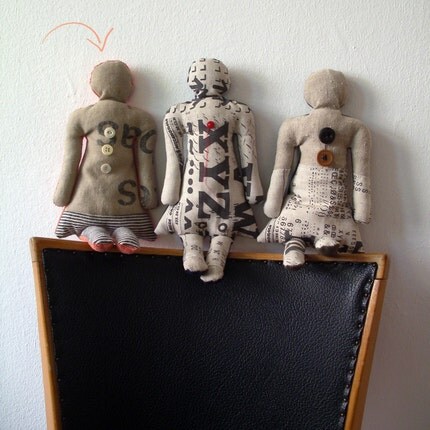 I love the way she uses materials with a previous life in new and interesting ways — and of course I love the element of vintage typography!
