Officially, Pantone named two colors of the year for 2016: Rose Quartz and Serenity (which is a sort of pastel blue), but so far from where I stand it’s been all about lovely shades of blush pink.
First, bride-to-be Krista got in touch. I had designed and printed her save the date coasters last year and they were some of my favorites, so I was thrilled to hear from her! I’ll do a bigger reveal after their wedding day, but here’s a sneak peek of their dusty rose wrap that holds all the invitation elements together.

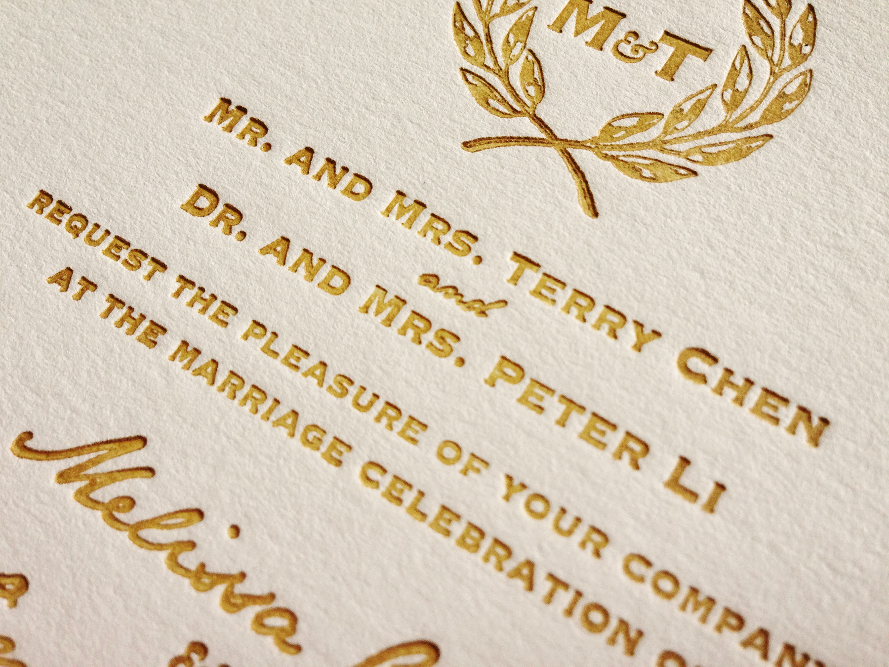
Another bride from last year got in touch just after Krista. The future Mrs. O’Brien went for a more formal design for her wedding stationery, which features the same pink filigree pattern, gold family crest and formal script as her save the dates. Her invitations are hot off the press (and drying all over my house) as I type, so I don’t even have a sneak peek for you yet, but stay tuned!

I’ve also been working on non-letterpress wedding invitations lately. I’ve been thinking about offering less expensive options for a while now, since not every bride can or wants to spend several hundred (or more) dollars on their invitations. And, as smaller celebrations become more popular, the price-per-invite goes up, since the initial supply costs for letterpress work are so high. Although personally I still think it’s totally worth it!
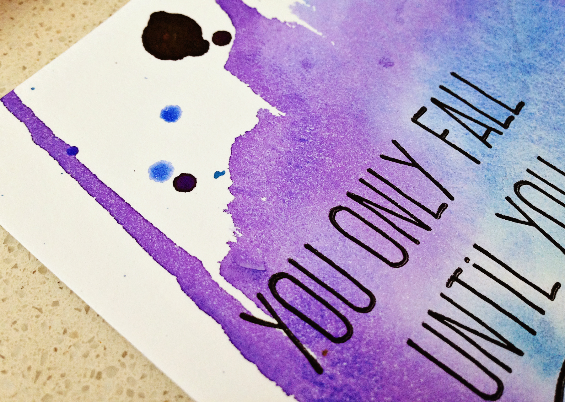
I recently connected with a photographer via The Rising Tide Society that offered to shoot some of my new invites! Nicole over at Simply Charming Pictures did a great job, I can’t wait to share the rest of her work! Watercolor invitations aren’t yet available online, but get in touch if you’re interested!

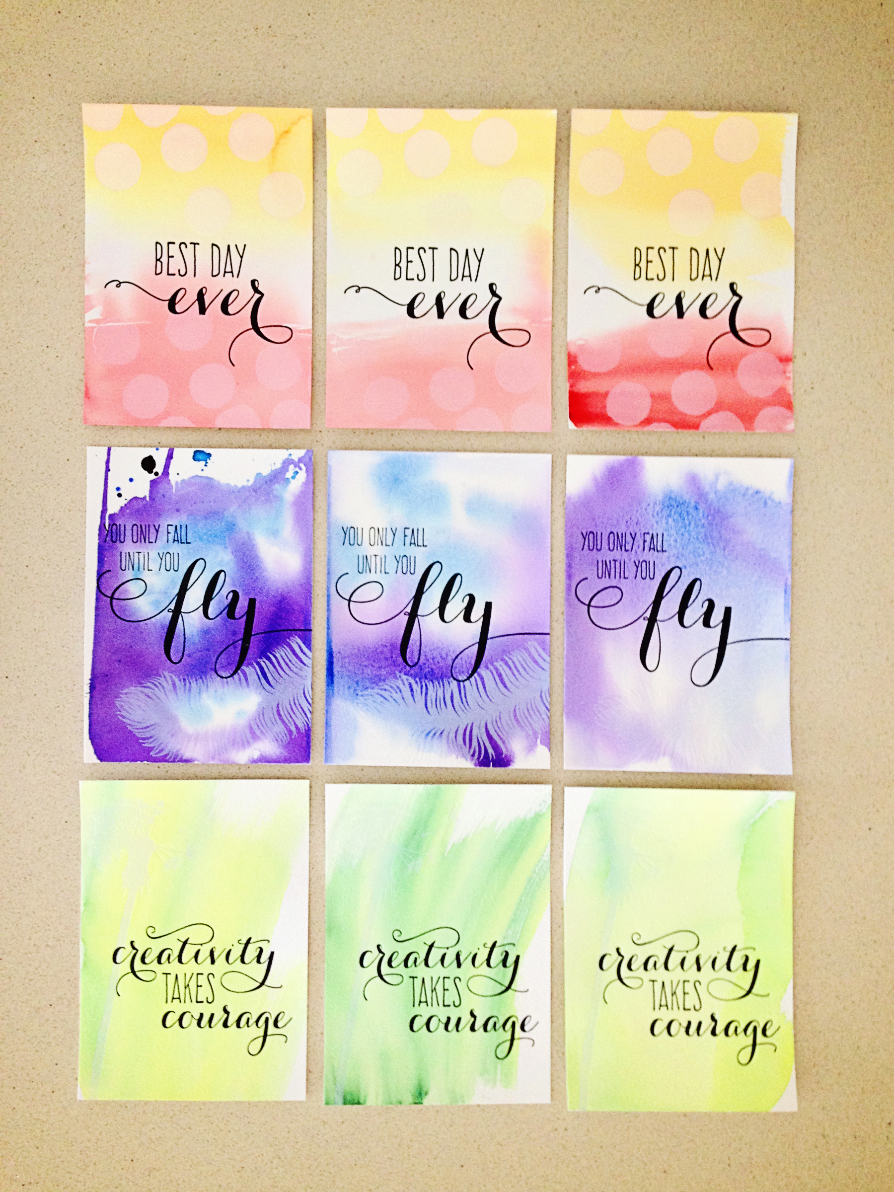
As I was finishing up those big wedding projects, a new mom got in touch via Etsy about invitations for her baby girl’s first birthday party. She loved my Watercolor Ombre Fill-in Invitations, but wondered if I could make them in pink and gold instead… to which I said of course! I knew I would love the results, so I made an extra set to list in the shop—find them here!
 And finally, I’ve finally started ordering a few new printing plates for my own projects. You may have noticed I didn’t launch as many new cards last year. When I first moved, I was so excited to have so much time for letterpress work that I may have gone a little crazy and printed all the cards I’d had bouncing around my head for years but never had the time to print, and my stock got a little out of hand. Not only do I have limited space to store everything, but it’s difficult to keep track of nearly 200 different designs!
Someday when I have my own shop, I’ll be able to maintain that kind of inventory, but for the time being, I needed to pare things down. I’m finally at a place now where enough designs have sold out so I’m ready to create some new work!
 Far and away my favorite of the new fonts I bought a few months back is this beautiful modern calligraphy typeface. It’s perfect for wedding season! My “Mr & Mrs” cards have always been popular, but I’ve been feeling like the design needed an upgrade, so I designed these! Pick up a set here. I also wanted to created a new design that would not only work for weddings (and not even same-sex unions at that), but any joyous occasion—birthdays, adoption, engagement, graduation… you name it, this card works. Available in blush here, but I’m thinking of printing them in lots of colors… feel free to comment with what you’d like to see next!