Updated Studio Tour

5R0A9361

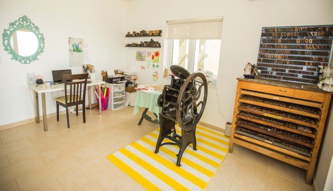
Remember my rush of new retailers this spring? One of them, Apartment 528, asked for a home/studio tour and instagram takeover a few weeks ago. I gladly obliged, with the help of my friend and photographer, Adrian Cunningham. Since this was a rare occasion when the studio has been clean enough to photograph, I thought I’d share it here as well!

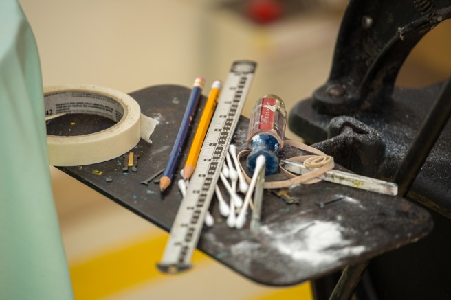
First, and perhaps foremost, are the incredible macro shots he took of Bess. I really beleive that every piece of her is a work of art, so to have someone else see that too is really rewarding for me.

These are shots of the materials I use to set up my press. (Except the thread. That has nothing to do with letterpress, it’s just where my thread rack lives.) Since I just converted  to boxcar’s printing plate system, I’m currently switching between their photopolymer plates and base (top photo), Owosso’s magnesium and wood plates and vintage wood type (below center). It’s sort of a pain, but as I retired the designs I used Owosso for, it will become easier!

The other shots here are of my ink (right) and tools (left above and below). Maybe it’s my art background, but I find it really wasteful to order a million different ink colors when you can make almost any hue from black, white, red, yellow and blue. So, along with silver and gold, that’s what you see in the tins above.

Most of the tools below contribute to making sure the paper is aligned and printed with the proper pressure. Adi somehow managed to find the only messy area in my press room that day!
5R0A9289

And below are a few projects I had in the works at the time: Thank you tags to include in future orders, and paper flowers, of course!

A Simple Hello

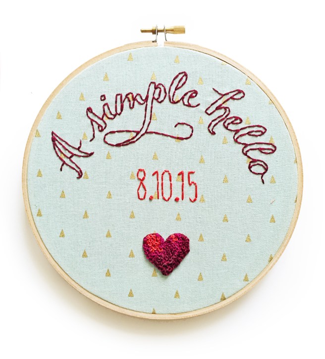
A few weeks ago, a lovely young woman got in touch about a custom embroidery hoop. She’s looking forward to her first anniversary with her boyfriend, and wanted to memorialize the first email he ever sent her in a hoop.

a_simple_hello_4936

She had checked out the rest of my work and loved it, so essentially gave me carte blanche on the design. I absolutely love how it turned out—and better yet so does she! I love creating custom pieces, so if you’ve got something in mind, don’t hesitate to get in touch!

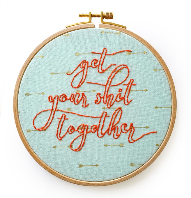
She also ordered one of my favorite hoops along with her custom design, so “get your shit together” is now out of stock! I’ll probably make another at some point, but if you want one sooner than later, you know how to find me.

get_your_shit_together_1394

While I was in the mood, I thought it was only fitting that I should embroider some more foul language on a couple of sweet little hoops.

Welcome_apt_4943

I’ve had the idea of a hoop that says “Welcome to my shitty apartment” for a while now, so I finally got around to stitching it! And I added a miniature succulent at the bottom, you know, to class it up a little.

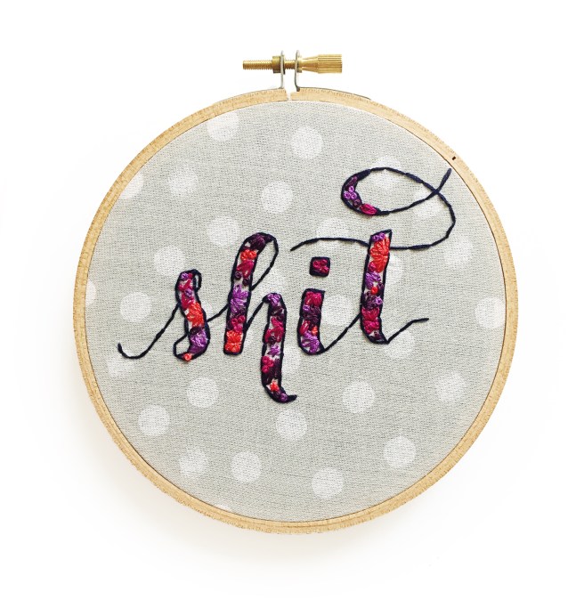
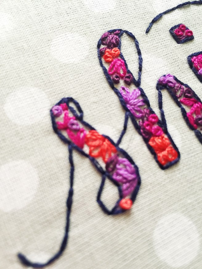
Speaking of classy, this fancy hand-lettered, floral-filled “shit” hoop absolutely cracks me up. It’s just SO PRETTY! I’m thinking a series of hoops in this style may be in order… in the mean time, find this one in my etsy shop!

shit_4937shit_4939

Adrienne & Matt’s Pink and Gold Wedding Invitations

obrien_1967

Adrienne is a classic bride planning a traditional ceremony and reception in the heart of small town Pennsylvania. Her vision for the big day was a formal affair in shades of white and ivory with accents of soft rose and warm metallics.

obrien_1943

Because her venue has a casual name, she wanted invitations that emphasized the formal nature of the day, which we accomplished with a formal filigree design motif and traditional typography. She also wanted to incorporate her future husband’s family crest, which I re-illustrated from an old photo and worked into their save the dates, flap of the pocket envelope, and the coasters which will adorn their reception tables (she also ordered extras to have on hand at home, which I love!).

obrien_coasters_1327

Once we had the design finished, I printed each piece by hand on my antique letterpress in a subtly metallic antique gold ink accompanied by a custom-mixed shade of pink. I love the mix of paper stocks that reflect her color scheme, employing my favorite bright white cotton paper from Crane, as well as rose inserts, sparkling gold envelopes and a lovely cream pocket to keep everything together.

obrien_1949

Red Wedding Flowers

5R0A0960

Sorry for the radio silence, friends, I’ve been super busy playing catch up from being away and working on some really exciting new projects!

The day before we left for Chile, a big order for paper flowers came in, and I was so excited because it was my first full wedding order, and so disappointed because I figured I’d have to refund it, as I wouldn’t be able to work on it for nearly two weeks. Lucky for me, this bride was planning ahead, and we had plenty of time before her big day!

5R0A0877_sm 5R0A0880

So the day after we got home, I got to work on this gorgeous flower crown and a large bouquet for the bride, along with a smaller bouquet (pictured) and boutonnieres! 5R0A0910 5R0A0925 5R0A0950

I tried some new techniques with my poppies and I’m absolutely loving how they’ve turned out! One of the things I love most about making paper flowers is the problem solving, always striving to make them more realistic and more beautiful. 5R0A0971

A special thanks to Adrian Cunningham of Ballyknock Photography for taking a few quick snaps before I sent them off to Australia!