A Pocket Full of Posies

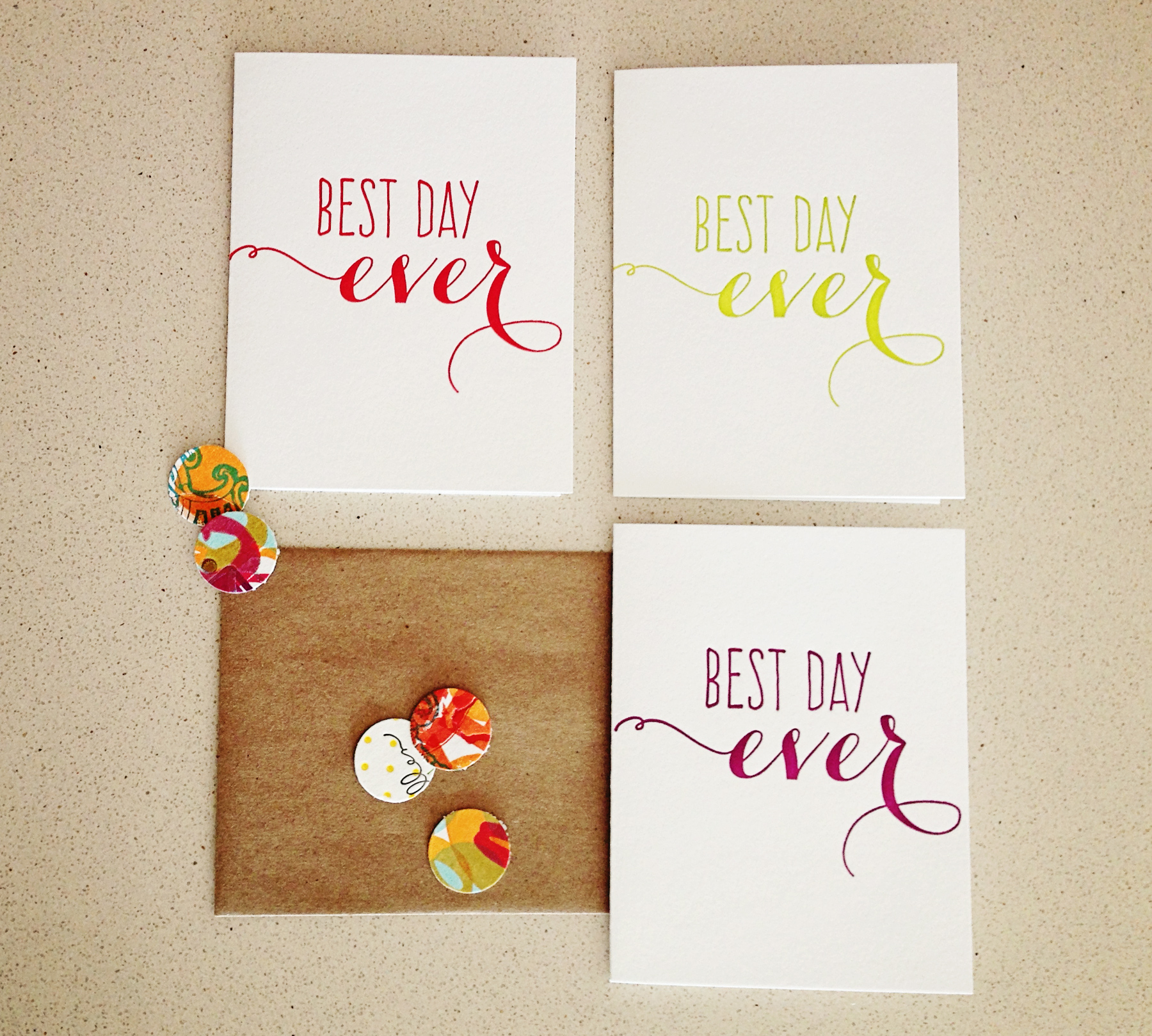
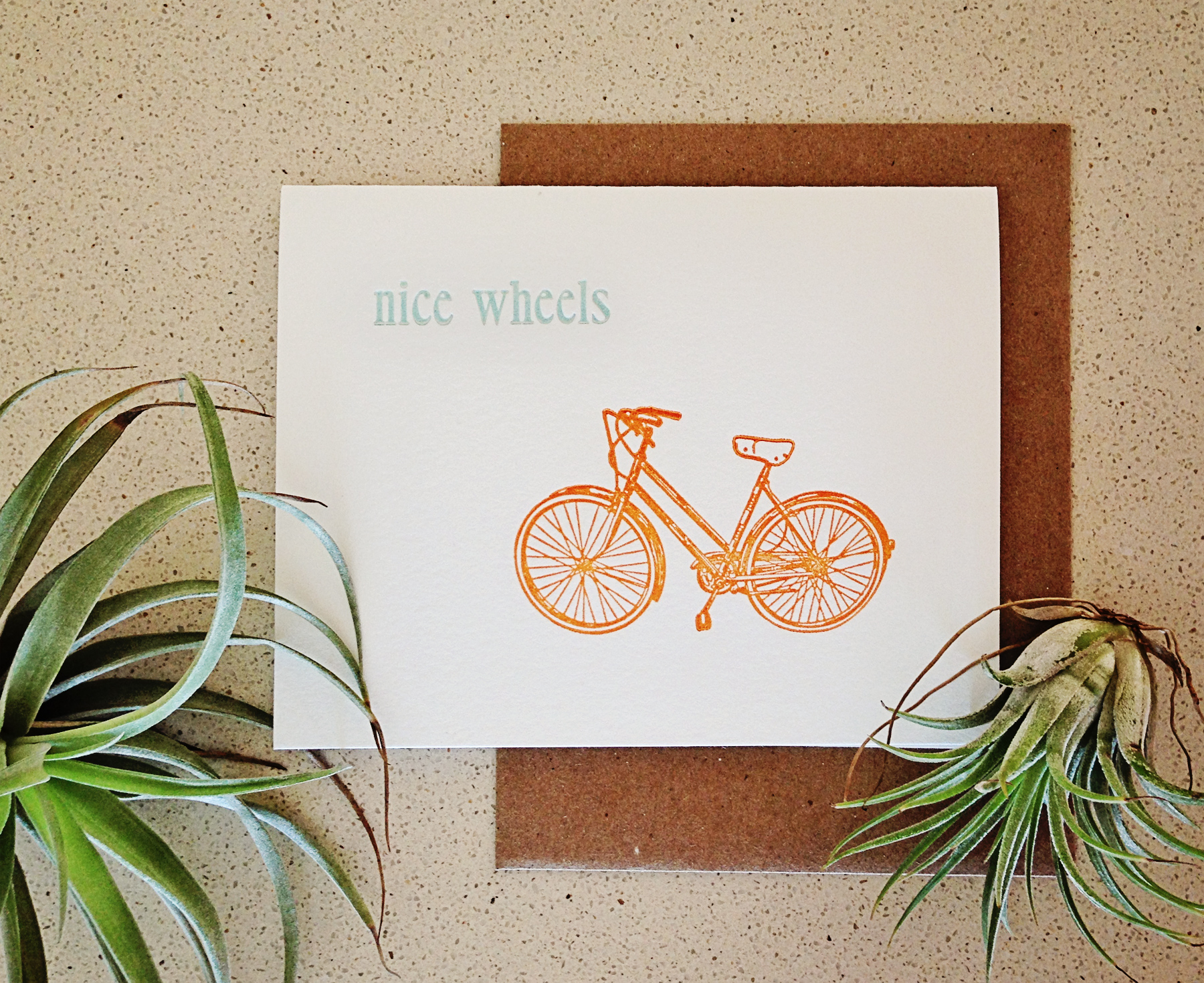
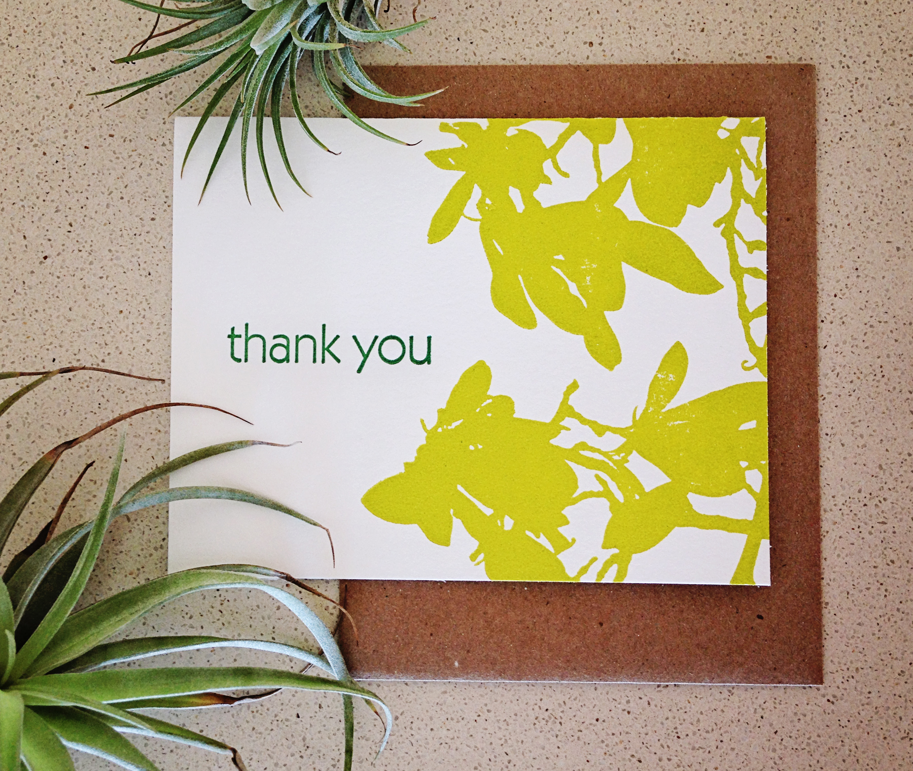
I’ve been working on this project for so long, it almost feels like old news now, but I’m still excited to finally share it with you!

Several weeks ago, a pair California floral shop owners got in touch about business cards. After only a few emails back and forth, I realized they were pretty much my ideal clients—quick and decisive with feedback, open to new ideas, and maybe most importantly, they seemed to truly understand and value the work that goes into letterpress printing. Plus, they were interested in incorporating my new watercolor illustration services into their cards!

Pocket_of_Posies_6472We nailed down the design after just a few rounds, and I ordered plates toward the beginning of March, allowing me plenty of time to print before my recent house guests arrived. You know the quote about the best-laid plans? UPS of course “misplaced” my printing plates for 10—TEN!—days in one of their facilities, and then instead of realizing the mistake and attempting to make up for it by rushing the order the rest of the way, it spent the next several days moseying along on a truck. I had planned to have it delivered to my friends who were coming to visit, since that’s usually faster (and always a lot cheaper) than having it shipped to the island, but of course it didn’t arrive before their flight. After several hours of calling 1-800 numbers by both me and my boyfriend, Owosso (the company that makes my plates) finally stepped in and managed to have them rerouted to Bermuda by the end of the week which was lovely… except that I had to pay an additional 40% in duty and “airport fees” (whatever that is).

Lucky for me, from then on it was smooth sailing. I printed the card backs the day after receiving the plates, and let them dry for about two weeks. I was surprised by the amount of ink the all-over pattern used up, but they turned out just fine. The fronts printed even more beautifully—and then the fun began!

Pocket_of_Posies_6470I hand-painted a funky flower on each card individually—at one point I had them drying all over the living room floor. As always, the cards were finished by hand-cutting them to size and sorting out the best ones to send to the client! I’m so happy with how they turned out and I can’t wait until they arrive in California to hear what Taryn and Michelle think!

Pocket_of_Posies_6475

Reprints & Revamps

Last week, I sent off an order from my longest standing—and if we’re being honest, one of my favorite!—wholesale client. Driftless Studio has been carrying 622 press goodies consistently since 2009. The owner, Anne, is fabulous to work with—tactile and appreciative of the artsy imperfections of letterpress; decisive and trusting of her intuition when it comes to stocking the shop; and always offering creative ideas to collaborate on pieces she thinks will sell well.

bestdayever_multi_6156These collaborations have resulted in a few designs that are completely exclusive to her shop as well as small tweaks on existing designs—like our Best Day Ever cards in a bunch of new colors! I printed extras for my etsy shop as well, so get a multi-pack here, or individual cards here, here and here.

WI_6382Driftless Studio is located right in the heart of downtown, which is dominated by UW-Madison, so anything printed in red or Wisconsin-themed always sells well. With graduation soon approaching, they stocked up! The Wisconsin notecards are also available in my etsy shop.

nicewheels_6357The best part about having such a long-standing relationship is that Driftless still stocks a number of designs I haven’t had a chance to print recently. With more than 100 unique cards, it’s hard to keep them all in stock at once, so when the shop needed more nice wheels and magnolia thank you cards, I was all too happy to reprint some for the 622 etsy shop as well. magnolia_thankyou_6352

Business Cards: The Sequel

It’s taken a few years, but I can finally admit that when I started this business I had no idea what I was doing. My previous letterpress experience had come from a fine art environment, where imperfections are talked away as a beautiful expression of the intrinsic nature of the medium (not that that’s not true—I love a good happy accident!).

But when it comes to someone’s business cards or wedding invitations, those little variances that make each piece uniquely handmade can only be so noticeable before they become intrusive. I probably started taking on commercial jobs too early, and while my prices at the time reflected that—holy crap was I cheap!—I do sometimes wish I had spent more time on technical skills before diving in head first.

Fast forward seven years and my skills are miles ahead of where they once were—but so are my standards. I find myself fretting over a tiny imperfection I wouldn’t have even noticed a few years ago… all the time.

So a quick email with a few positive words from a client is just about the best thing that can happen in a day, unless of course, a re-order comes in! This week, I’m super excited to be reprinting Meighan Newhouse’s business cards. It was only a year ago and they turned out pretty great last time (so much so that she says “I get SO many compliments on them! And I’m so proud to hand them out!”) and I think they’ll be even better this time around! Wish me happy printing!

colette_allen_5677

Modern Calligraphy

calligraphyIf you follow me on social media, you may remember the Laura Hooper calligraphy kit I received for Christmas last year. It took me three months, but I finally sat down and got started a few weeks ago!

To my own surprise, I’m completely hooked. I’ve spent several afternoons filling up the pages of my practice book until my fingers started to cramp and I feel like I’m starting to get a handle on my own particular style.

At first, it was all about consistency—mostly in width and height of the characters. I tended to start out with very large letters and they shrunk as the line went along. I also tweaked the forms of several letter forms—adding an extra loop inside letters like “a” and “o” and creating a completely different “k”—an important one since it’s in my name!

calligraphy_6087I’ve recently moved on to addresses, since being able to offer addressing services to wedding clients was the main catalyst for learning calligraphy. I still have some progress to make to figure out the layout and spacing I like, but things are coming along.

IMG_6154I also experimented with the white ink that came in the kit and created this lovely design below. I’m thinking I may sell it as a digital print in my etsy shop… stay tuned!

homesweethome_6120

Warm Gold Wedding Invites

I’ve been reshooting and pitching letterpress projects to various blogs lately, and it made me think about all the projects you missed while I wasn’t blogging last year! So, I’m going to start reminiscing and featuring a few of my favorites over the next couple weeks. Remember: if you see something you like, don’t hesitate to get in touch!

First up: One of the other wedding invitations I had on my plate last year. This one was a little simpler than Amy’s wedding stationery extravaganza, but no less beautiful.

When the bride, Melissa, contacted me, she already had a design for her invitations worked up—and it featured a crest that the groom had drawn himself. I love that the couple worked together to create their invites! I helped Melissa with some of the technical aspects of the files while she had a trial version of InDesign, and converted the leaves to vectors myself.

Chen_5636Since I have two different gold inks (one that prints like shit but is very sparkly, and one that is not so sparkly, but more more reliable when it comes to print quality), I sent Melissa a few test samples with different proportions of each ink to choose from. Then, I spent a couple hours chopping up some lovely Pearl white Lettra paper and got to work!

The invitations turned out beautifully, with the simple design really showing off the impression one can achieve with letterpress.

Chen_5633