Don’t Worry, Bee Happy

Oh yeah, that just happened. Well kids, once again life has gotten in the way of ye olde blog, so instead of coming up with new, original content for you, I bring you the words of one of my favorite bloggers (and full disclosure: very good friend), Mollie Shambeau.

Miss Mollie is getting married in just over a month and I helped design her wedding stationery. She was kind enough to feature our work on her blog here.

Her invitations were a fun project, both because she has an impeccable sense of style and wanted to add a little whimsy with a play on her soon-to-be last name: Busby (Bus-bee, get it!?!).

Whenever I have a little down time , I try to pop over to The Mollie Shambeau Show to see what that girl is up to. One day she’s in Wisconsin, the next Australia, then Utah, then who knows! Just over a month ago now (jeez, has it been that long?!), she wrote the loveliest post that expresses exactly why I chose to create greeting cards with my letterpress.

On a day when life was handing me too much, I had dinner with a dear friend who brought such positivity to everything I blabbered on about, I really did intend to send her a thank you card just for being herself. And of course even I—with boxes and boxes full of beautiful ephemera—didn’t follow through on my intentions.

A week or two later, I came across Mollie’s words and after kicking myself for my lack of follow-through, took the same vow:

I vow to try my best to not take anyone in my life for granted

2011 July 6
by Mollie

The last few weeks have been a learning experience for me. Not only because I’ve been living in my parents’ basement (oh yeah) and planning a wedding that’s happening in LESS THAN THREE MONTHS (mini heart-attack) but because I’ve learned a lot about myself and my relationships with others.

And though I should be feverishly working on another set of important vows in my life, I have one I’ve been wanting to disclose here:

I vow to try my best to not take anyone in my life for granted.

It began with a stack of cards. There are people out there (some of whom are probably reading this) that actually thought to send me a congratulations card after Sean and I got engaged. HOW THOUGHTFUL IS THAT? Seriously, it was so thoughtful that I started to question my own track record with cards. Lets just say I came up a little short.

There is something to be said for “card people,” right? Are you a card person? Prior to recently, I was not. Thank you notes? Of course. Birthday cards? Maybe, if I was seeing the friend in person. Cards for lesser occasions (arguably the cards that really matter) like Get Well Soon, Thinking of You, Congrats, etc.? Er, no.

Card people… how admirable are they? You know, that one person in your life who NEVER forgets your birthday, always calls, and makes sure you get at least one card (and $5 to spend on chocolate) on Valentine’s Day. I always thought to myself, “Maybe someday I’ll have time to be so thoughtful.” I resolved I was simply too cheap and too busy to embody the “T” word—two excuses that make me cringe as I write this. Plus, living in Utah a world away from many of my college and high school friends and family  didn’t help to engage my sense of connection.

Well “someday” happened, baby. It’s time I climb aboard the Thoughtful Train… and I would like to extend an invitation to you.

I’d like to hope every woman reaches this point in her life. The point when she realizes that making that extra effort is important. Sure it may not be convenient to respond to an email or send a congratulatory card to a recently engaged pal, but you know what? Life isn’t convenient. I’ve got one hand on the computer keyboard and a sandwich in my other hand while I add, “Pick up dog poops in the yard” and “Write 1200-word story for the paper” to my To-do list and catch snippets on my iPhone from the Casey Anthony trial, all the while cursing my well-intentioned suggestion to watch “Father of the Bride” as tears of nostalgia run down my face (true story).

Life isn’t convenient and it never will be.

Going the extra mile for the important people in your life is—I believe—one of the most imperative and rewarding actions a human can take. Without friends and family in your life, would it be worth it?

Think about it. Hop on the train. Send a freaking card ☺ And have a wonderful day!
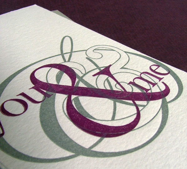
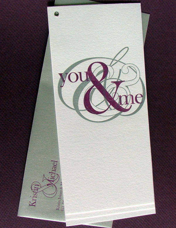
you & me part 1: Invitations

Hello readers! (Are there any of you left out there?) So sorry for once again becoming MIA—it’s been a busy couple of months. First and foremost, we got married! I of course went the DIY route for as much as I could—which, turns out, is completely insane, but I couldn’t have been happier with the results of all the projects.

First up: Invitations

For those of you who know me in real life, it will come as no surprise that the day after I received Dave Matthews Band’s Big Whiskey and the GrooGrux King in the mail (I pre-ordered, natch) I announced to the fiance that we would be dancing to “You & Me” for our first dance. Let’s just stop right here; have you heard it? No? I’m going to need you to go ahead and click right here, or here if you’re more into live music, before we can proceed.

There, I feel better. See what I mean? Beautiful song, PERFECT for a first dance.

Anyway, I’m getting sidetracked. The point I’m trying to make here is that this song inspired the design for the invitations, which I naturally carried through all the stationery and decor for the entire day. What? We need another aside? Ok, here goes:

Why do you need consistency throughout the visuals for an event? (Some might call it a theme, but I hesitate to do so…makes me think of the appalling prom themes we had in high school: “Under the Sea,” “A Midsummer Night’s Dream”—the last one you might think could be pretty gorgeous, except that whoever was in charge of the decor chose to accentuate the browns and olives of the forest setting instead of the magical quality of Shakespeare’s masterpiece. Anyway, really off track now.)

First of all, I needed a consistent identity for my wedding because I’m a graphic designer. It’s what I do.There’s nothing I hate more than receiving a save the date with one look, an invitation with a completely separate one, placecards that have nothing to do with either and a thank-you that appears to be chosen completely at random.

Second, having a consistent look for your event forces you to really think about what your goals for the day are and how you want to represent that. It helps you to avoid magpie syndrome (“Ooh! Shiny thing!”). Your invitation tells guests what to expect and your thank you note reminds them of your day.

Anyway, back to the invitation. I’ve designed invitations for many different couples holding receptions that are as unique as they are. I’ve done tons of research into invite trends, I surround myself with good design day in and day out. But when it came to designing my own, I was stumped. I literally sat with a blank page open on my computer for three weeks.

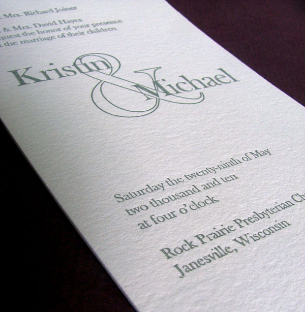
Finally, I decided to eschew illustration entirely and focus on making the typography the star of the show. (Readers who know my design work are saying “DUH!” right now.) Once I finally made a decision, everything came together easily and turned out beautifully.

Our day was simple and elegant and so were our invitations. I chose the tall and skinny format suited to a #10 envelope (if they hadn’t been so heavy, they could have been mailed with regular postage!).

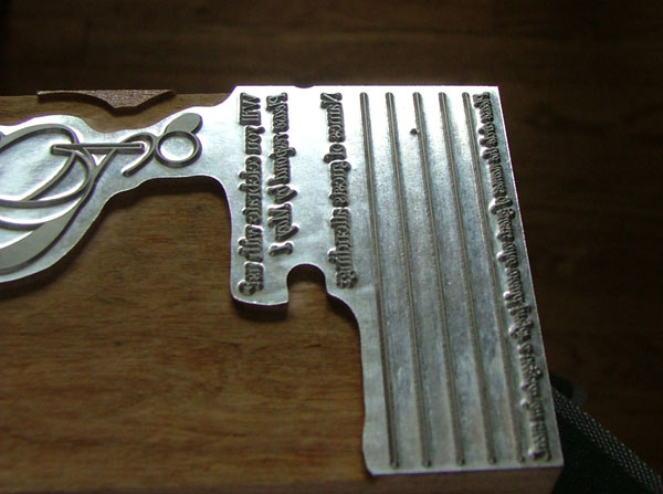
I spent several full days printing—completely filling our house with pieces of cardboard covered in invite pages as we waited for them to dry—and then my mom came down for a weekend of assembly. I kept it pretty simple; just a single grommet in the corner purchased from a local scrapbook shop. I paired the silver and plum printing on Crane’s bright white lettra with metallic silver envelopes that I printed in plum.

Instead of creating a separate RSVP card, I incorporated it into the invitation itself and simply cut a line of perforation above it so guests could tear them off and return them in the provided mini envelope.

Farm wedding invitations

Because we’re living in a teeny apartment for the summer while we house shop, my press has not yet joined me in Iowa City. By and large, I’m not taking on any more custom orders until things settle down and I know what state my studio and free time are in. I finished up the last few orders for wedding invitations the Friday before we moved, and hopefully the next time I head to Wisconsin, I’ll be able to take care of several of my own projects that have languished for weeks (a happy birthday card, finally!).

greeninvite_1

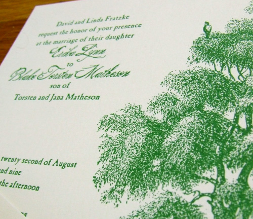
This is one set of the invites I just finished, made for a beautifully rustic late summer wedding. She wanted a big ol’ tree to reflect the setting, he wanted some elements of birds, and viola! The lovely kelly green (so on trend!) is courtesy of the couple as well, they sent me a ribbon that matches the bridesmaids’ dresses.

greeninvite_2

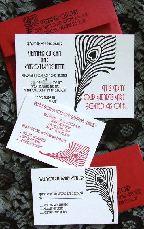
Art Deco Invitations

feather_invite1

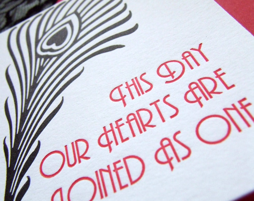
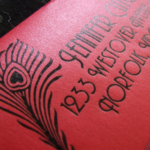
I just finished up an invitation suite for Jen and Aaron’s summer wedding. They’re having an art deco theme throughout the event and wanted the invitations to really reflect that, so I used a really authentic typeface and carried a funky feather motif throughout all the pieces in the suite.

feather_invite2

It was my first time printing metallic envelopes, and although they took forever to dry, everything turned out beautifully and I’m really happy with the invitations!

feather_invite3

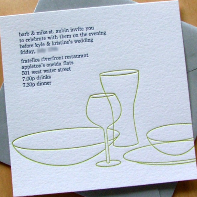
Kyle & Kristine’s rehearsal dinner

kk_rehearsal3

Another couple decided my tablescape invitations would be perfect for their rehearsal dinner. I love the color combination and how deep I got the impression.

kk_rehearsal

They also had me design and print a parking insert to meld seamlessly into their existing invitation suite. It’s not my usual aesthetic, but I really had a lot of fun working with the idea.

kk_enclosure