Business Cards: The Sequel

It’s taken a few years, but I can finally admit that when I started this business I had no idea what I was doing. My previous letterpress experience had come from a fine art environment, where imperfections are talked away as a beautiful expression of the intrinsic nature of the medium (not that that’s not true—I love a good happy accident!).

But when it comes to someone’s business cards or wedding invitations, those little variances that make each piece uniquely handmade can only be so noticeable before they become intrusive. I probably started taking on commercial jobs too early, and while my prices at the time reflected that—holy crap was I cheap!—I do sometimes wish I had spent more time on technical skills before diving in head first.

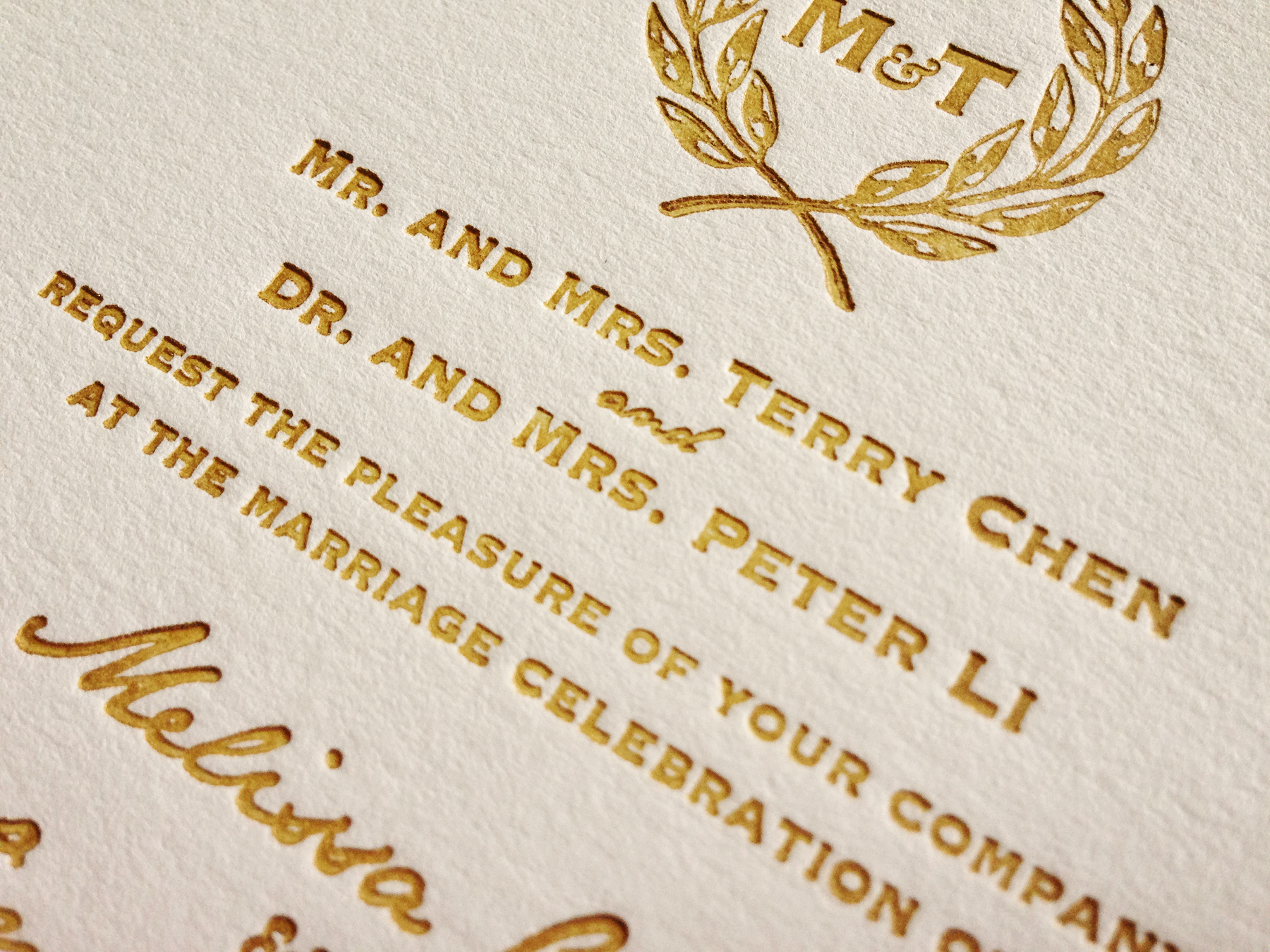
Fast forward seven years and my skills are miles ahead of where they once were—but so are my standards. I find myself fretting over a tiny imperfection I wouldn’t have even noticed a few years ago… all the time.

So a quick email with a few positive words from a client is just about the best thing that can happen in a day, unless of course, a re-order comes in! This week, I’m super excited to be reprinting Meighan Newhouse’s business cards. It was only a year ago and they turned out pretty great last time (so much so that she says “I get SO many compliments on them! And I’m so proud to hand them out!”) and I think they’ll be even better this time around! Wish me happy printing!

colette_allen_5677

Warm Gold Wedding Invites

I’ve been reshooting and pitching letterpress projects to various blogs lately, and it made me think about all the projects you missed while I wasn’t blogging last year! So, I’m going to start reminiscing and featuring a few of my favorites over the next couple weeks. Remember: if you see something you like, don’t hesitate to get in touch!

First up: One of the other wedding invitations I had on my plate last year. This one was a little simpler than Amy’s wedding stationery extravaganza, but no less beautiful.

When the bride, Melissa, contacted me, she already had a design for her invitations worked up—and it featured a crest that the groom had drawn himself. I love that the couple worked together to create their invites! I helped Melissa with some of the technical aspects of the files while she had a trial version of InDesign, and converted the leaves to vectors myself.

Chen_5636Since I have two different gold inks (one that prints like shit but is very sparkly, and one that is not so sparkly, but more more reliable when it comes to print quality), I sent Melissa a few test samples with different proportions of each ink to choose from. Then, I spent a couple hours chopping up some lovely Pearl white Lettra paper and got to work!

The invitations turned out beautifully, with the simple design really showing off the impression one can achieve with letterpress.

Chen_5633

Prints & Recreation

Happy Galentine’s Day, dear readers! (Please tell me you totally got the Leslie Knope reference here.) Aaaaanyway all this romantic hullabaloo has me thinking about a Valentine making kit I had when I was young. It was filled with scraps of (fake) Victorian ephemera, little photos, pieces of lace and doilies and plastic rhinestones with adhesive on the back (way to be authentic, kit-makers).

This little seed has had me pondering ephemera and the ephemeral… after all, that is what I spend my life making these days. Ephemera traditionally refers to printed paper material—things that don’t last. Ephemeral essentially means temporary, but in an age of instant messages, facebook photo albums and email, almost everything stays digital—it’s the printed material that we hold on to and treasure. We only print the truly special photographs, or the important documents we cannot afford to lose in a cluttered inbox. Hand written notes get tucked away into secret hiding spaces to be pulled out when we need to feel a connection perfectly typed words can’t provide.

This is really just a long-winded way of saying now that the ephemera I make might be treasured years into the future, I totally overthink what I’m designing. Is it timeless? Will it feel classic or dated a decade from now? Does that matter? After all, we make Valentines with aesthetics that went extinct more than a century ago, we collect antique dishware and glorify the ‘60s and ‘70s, even though we wouldn’t be caught dead in Technicolor bell bottoms.

And maybe that’s part of the point—to capture a bit of the time period and remind us of what we thought was cool, even thought it’s not any more. (And who knows, if you wait long enough, it probably will be again! See: shoulder pads, neon, bow ties, mustaches…)

And so (here’s the part where I stop rambling and get to the point), with my new collection launching next week, I tried to design for how I’m feeling now, in early 2015, and not worry so much whether I’ll like these designs three years from now. And it feels like it worked. There’s a feeling of exuberance that my stationery hasn’t had up till this point. Letting go has released a sort of joy, which translates to the page, and is a good reminder for life. So while I’m still saving for retirement, I’m also trying to keep my mind in the present and live like life is ephemeral, because it is.

DIY printing plates

lino_5028

Before the big move, I picked up a couple linoleum printing blocks at an art store in Madison. The printing plates I order from Owosso are expensive and getting pricier all the time, so I thought carving my own would be a great way to save a little money on simpler designs.

One of the components of my new collection happened to be perfectly suited to hand carving, so last week I sat on my porch with my Dremel and went at it! Below is the before and after—can’t wait to see how they print!

lino_5025