Remember how almost two years ago I asked you to submit quotes you’d like to see printed? And then remember how life got all sorts of crazy and I never got around to printing them? That was awesome. (Please tell me you all got the Chris Farley reference.)
 Anyway, finally got around to printing the first one…no guarantees the second will be done in less time. You can purchase here. And yes, Sarah, you have a couple headed your way! It might take me while but I keep my promises.
Keeping with the theme, I gave my mom a stack of blank cards last year for Mother’s Day and told her I’d print whatever she wanted on them. Just finally finished those up as well! Most of them went to good ol’ Marge, but there are a few extras available here.

 Karin says, “When I make something, I don’t have a clear vision of how it should look like. I throw my table full of materials and start working and combining. Textures, colours, shapes. Things evolve by starting making them. I mostly get inspired by the material itself.”
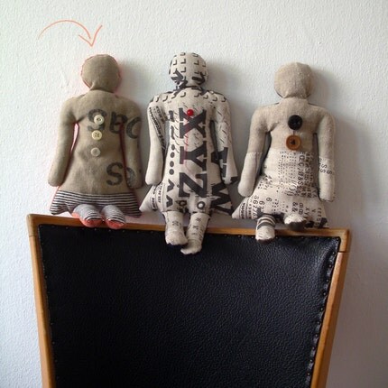 I love the way she uses materials with a previous life in new and interesting ways — and of course I love the element of vintage typography!

 Lately, I’ve been getting back into typography. I finally began several projects using all my vintage wood and lead type — one notecard is featured here, lots more to come! You can pick up this card
 These stainless steel letterforms were rescued from a 1950’s era New York parking garage that was being demolished in 2002. They are available
  These ceramic letters once lived to title 8mm & 16mm home movies. They are available at Portland’s Noun: A person’s place for things (which is such a clever name, I just love it!) as well as in their online store