As letterpress becomes more popular, more and more customers want their pieces to look LETTERPRESSED, by which I mean they want their design to be printed with a deep impression that they cannot only see but feel. That is the point of springing for letterpress isn’t it?
Results on my press can vary greatly and what I’m learning is that the design of the piece can influence the depth of the impression just as much as any adjustments I make on press. Some designs can only go so deep.
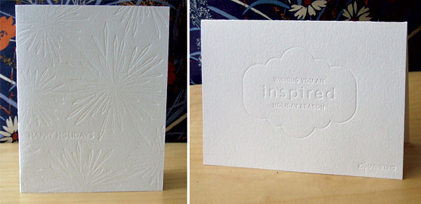
 Take, for example, these two holiday cards I embossed a few years back. The design on the left is a busy, all-over design that consists of many very thin lines. When a plate like this is pushed into the paper, the paper has nowhere to go, no space to give to the design on the plate. The result is a relatively light impression, especially in the areas where the design is particularly concentrated.
The design on the left is much simpler, with slightly thicker lines and less of the paper covered with them. The result? A very clear, deep impression.
One thought on “Impressions”