New Personal Stationery

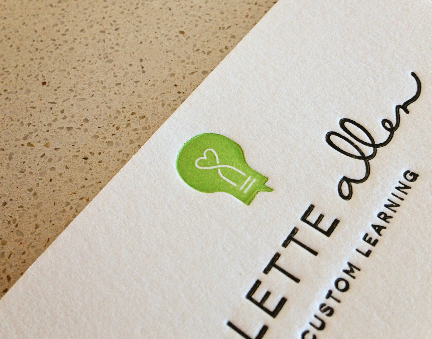
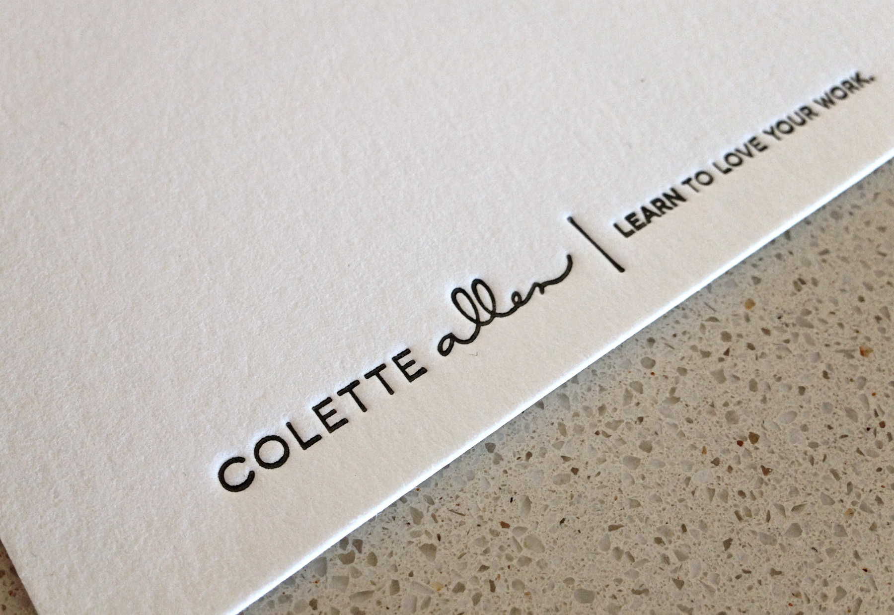
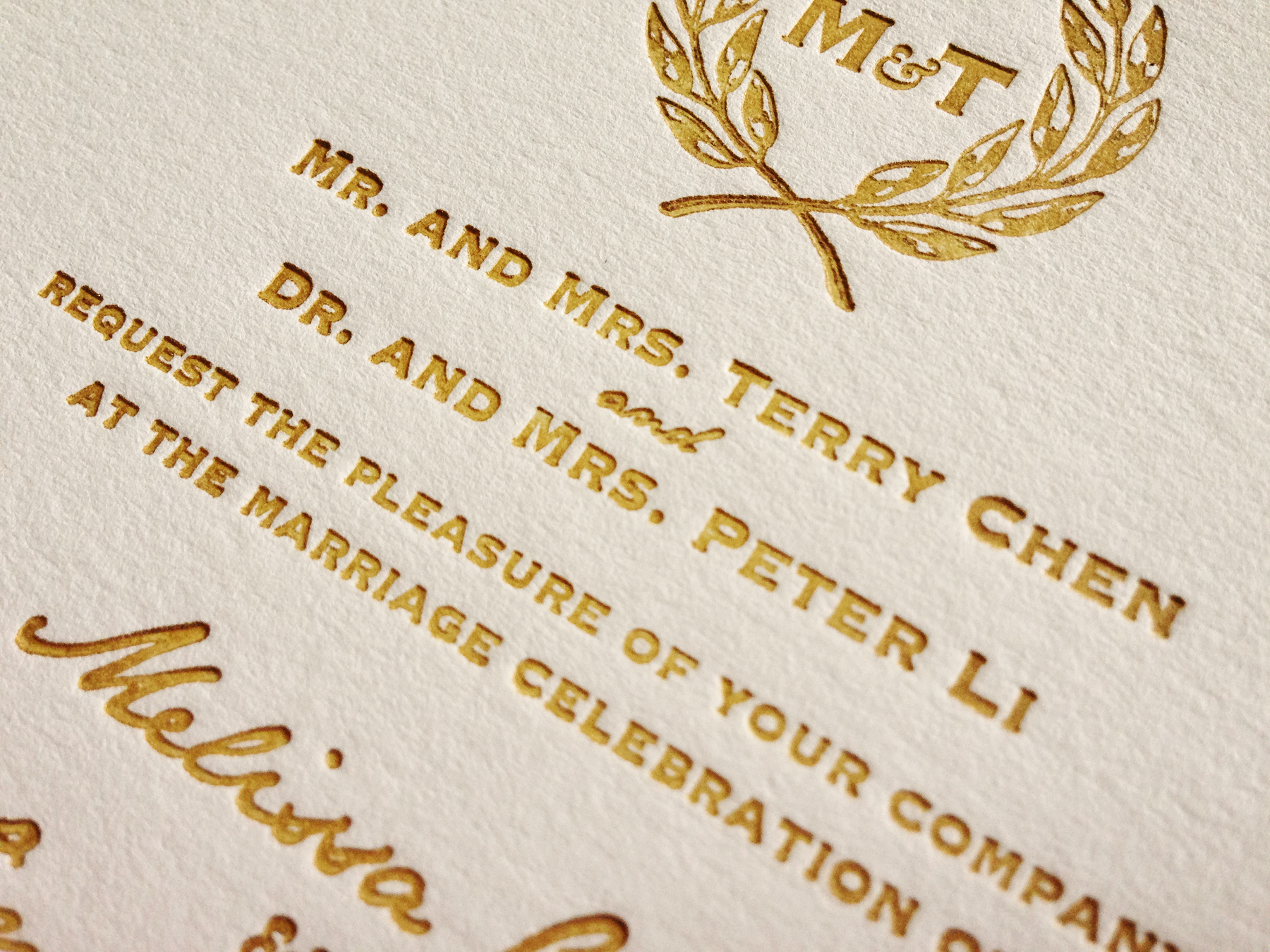
I have an uncle that’s really into antiques—when they built their house, they incorporated display space for a well-curated collection of old signage, vintage machines, furniture and more. So it was no surprise when he sent me a link to an awesome Craigslist find: a complete 18-point lead font for $40.

Andrew_5115
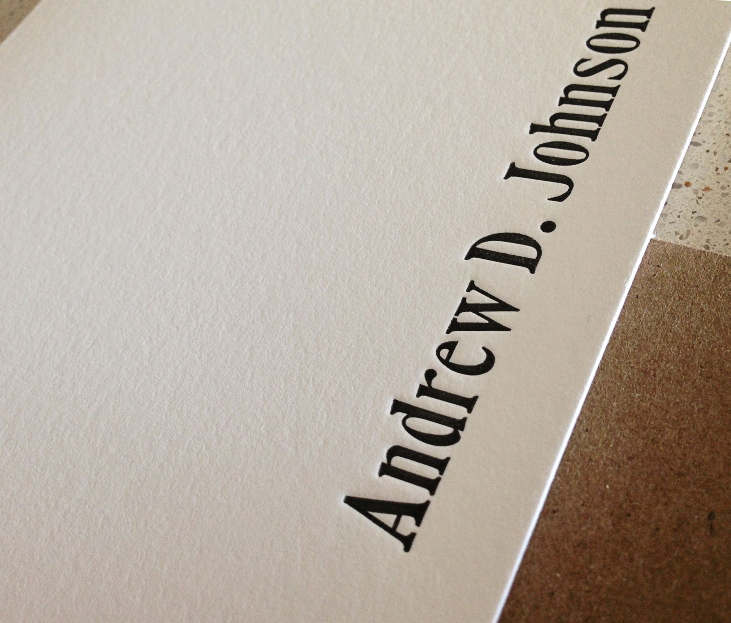
Needless to say, I scooped it up right away and it has become an essential component in my studio as it mixes in so well with my larger type. It’s also the perfect size for stationery featuring a full name instead of just a few initials. And because it’s lead type, it can be printed with a very deep impression into the paper—it’s really incredible in person! You can order the new stationery here, or just send me a message! Enjoy!

Andrew_5117


Somebody get me a cocktail

Today is one I’ve been waiting for—in a few hours, a dear friend and her husband (and first Bermuda visitors) arrive and tonight we’re celebrating her 30th birthday. So it seems an appropriate day to blog about cocktails!

french75_context_5885This month I’ve been painting a lot—reviving a love for watercolor I’ve had since childhood. A few weeks back, I started a series of classic cocktails sketched with pencil and illuminated with watercolor. I love the opportunity for both wet work—where the colors mix into each other—as well as layering transparent color on top of an area that has already dried, to create the illusion of glass.

martini_oldfashioned_frameThe original paintings are now available in my etsy shop and I think they’d make the absolute perfect art for a home bar or even your kitchen! I’ll probably keep adding to this collection—do you have a favorite cocktail I should paint? Leave a comment below!

tequilasunrise_frame cosmo_context_5891

Warm Gold Wedding Invites

I’ve been reshooting and pitching letterpress projects to various blogs lately, and it made me think about all the projects you missed while I wasn’t blogging last year! So, I’m going to start reminiscing and featuring a few of my favorites over the next couple weeks. Remember: if you see something you like, don’t hesitate to get in touch!

First up: One of the other wedding invitations I had on my plate last year. This one was a little simpler than Amy’s wedding stationery extravaganza, but no less beautiful.

When the bride, Melissa, contacted me, she already had a design for her invitations worked up—and it featured a crest that the groom had drawn himself. I love that the couple worked together to create their invites! I helped Melissa with some of the technical aspects of the files while she had a trial version of InDesign, and converted the leaves to vectors myself.

Chen_5636Since I have two different gold inks (one that prints like shit but is very sparkly, and one that is not so sparkly, but more more reliable when it comes to print quality), I sent Melissa a few test samples with different proportions of each ink to choose from. Then, I spent a couple hours chopping up some lovely Pearl white Lettra paper and got to work!

The invitations turned out beautifully, with the simple design really showing off the impression one can achieve with letterpress.

Chen_5633