Save the Dates With Photos!

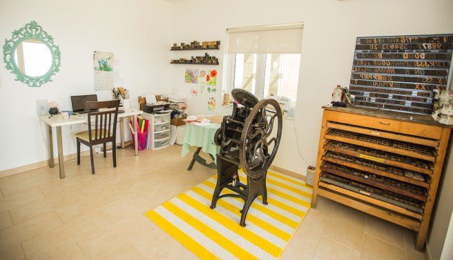
I love letterpress. A mechanical printing process just imbues such purpose into every piece, no matter what it is. But, it does have its drawbacks: mainly that it’s very difficult or impossible to reproduce 4-color images, like photos or watercolor.

Recently I’ve had a few couples interested in including an engagement photo on their save the date announcement, so I’ve gotten to design without the restrictions letterpress imposes, and set up a relationship with an offset printer. It’s been such fun!

Sara_Joe_5133

Sara reached out after seeing some of my save the date coasters on Wedding Lovely, however once I saw her hopes for her own design, I knew offset would be the way to go. They loved a hand-lettered look with lots of swashes—I loved how these turned out!

Allison_STD

Bride-to-be Allison has a more formal style, with classic calligraphy and romantic watercolor floral. I love how their monochromatic photo works with the rest of her design elements. Can’t wait to share her invitations with you next spring!

June & July Card Club — and an update!

You guys, I have just been the worst blogger lately! A little bit of writer’s block, a little bit of being overbooked… a whole lot of super short or non-existent blog posts!

As you know (or if you don’t, scroll back through the blog, I’ve had some fun projects lately!), I have been super busy—wedding season is in full swing! In addition to the amazing paper flower project I posted about a few weeks ago, I’ve designed two non-letterpress save the dates for 2017 brides and hand-painted graphics for two more real wedding invitations, and three more for styled shoots! Check back to see all of those (and even more watercolor wedding invites!) in the coming weeks, and in the mean time, here’s a sneak peek of Julie’s invitations:

FullSizeRender(1)

In addition to all this bridal goodness, I’ve also been designing new cards! You’ll have to wait till the holidays to see most of them, but keep an eye out for new birthday, thank you and sympathy cards in the mean time! A few of the latest and greatest designs are sure to be included in next month’s card club, so now is a great time to join! Here’s the link.

And of course, speaking of Card Club, I forgot to post July’s collection—again! Last month I was feeling the beach vibes, so I built the collection around shades of yellow, turquoise and sand.

COTM_716_4676This week, I’m feeling all pink all the time (just check out my instagram feed!), and mixing in some bright orange—plus bikes and balloons!—feels just right for summer! For a fun surprise, subscribers also received a 5″x7″ print of my watercolor bloom design from the Digital Prints section of my shop!

COTM_816_5125I absolutely love putting these collections together each month, so if you or someone you know loves getting mail, join the club today!

Updated Studio Tour

5R0A9361

Remember my rush of new retailers this spring? One of them, Apartment 528, asked for a home/studio tour and instagram takeover a few weeks ago. I gladly obliged, with the help of my friend and photographer, Adrian Cunningham. Since this was a rare occasion when the studio has been clean enough to photograph, I thought I’d share it here as well!

First, and perhaps foremost, are the incredible macro shots he took of Bess. I really beleive that every piece of her is a work of art, so to have someone else see that too is really rewarding for me.

These are shots of the materials I use to set up my press. (Except the thread. That has nothing to do with letterpress, it’s just where my thread rack lives.) Since I just converted  to boxcar’s printing plate system, I’m currently switching between their photopolymer plates and base (top photo), Owosso’s magnesium and wood plates and vintage wood type (below center). It’s sort of a pain, but as I retired the designs I used Owosso for, it will become easier!

The other shots here are of my ink (right) and tools (left above and below). Maybe it’s my art background, but I find it really wasteful to order a million different ink colors when you can make almost any hue from black, white, red, yellow and blue. So, along with silver and gold, that’s what you see in the tins above.

Most of the tools below contribute to making sure the paper is aligned and printed with the proper pressure. Adi somehow managed to find the only messy area in my press room that day!

5R0A9289

And below are a few projects I had in the works at the time: Thank you tags to include in future orders, and paper flowers, of course!

A Simple Hello

A few weeks ago, a lovely young woman got in touch about a custom embroidery hoop. She’s looking forward to her first anniversary with her boyfriend, and wanted to memorialize the first email he ever sent her in a hoop.

a_simple_hello_4936

She had checked out the rest of my work and loved it, so essentially gave me carte blanche on the design. I absolutely love how it turned out—and better yet so does she! I love creating custom pieces, so if you’ve got something in mind, don’t hesitate to get in touch!

She also ordered one of my favorite hoops along with her custom design, so “get your shit together” is now out of stock! I’ll probably make another at some point, but if you want one sooner than later, you know how to find me.

get_your_shit_together_1394

While I was in the mood, I thought it was only fitting that I should embroider some more foul language on a couple of sweet little hoops.

Welcome_apt_4943

I’ve had the idea of a hoop that says “Welcome to my shitty apartment” for a while now, so I finally got around to stitching it! And I added a miniature succulent at the bottom, you know, to class it up a little.

Speaking of classy, this fancy hand-lettered, floral-filled “shit” hoop absolutely cracks me up. It’s just SO PRETTY! I’m thinking a series of hoops in this style may be in order… in the mean time, find this one in my etsy shop!

shit_4937shit_4939

Adrienne & Matt’s Pink and Gold Wedding Invitations

obrien_1967

Adrienne is a classic bride planning a traditional ceremony and reception in the heart of small town Pennsylvania. Her vision for the big day was a formal affair in shades of white and ivory with accents of soft rose and warm metallics.

obrien_1943

Because her venue has a casual name, she wanted invitations that emphasized the formal nature of the day, which we accomplished with a formal filigree design motif and traditional typography. She also wanted to incorporate her future husband’s family crest, which I re-illustrated from an old photo and worked into their save the dates, flap of the pocket envelope, and the coasters which will adorn their reception tables (she also ordered extras to have on hand at home, which I love!).

obrien_coasters_1327

Once we had the design finished, I printed each piece by hand on my antique letterpress in a subtly metallic antique gold ink accompanied by a custom-mixed shade of pink. I love the mix of paper stocks that reflect her color scheme, employing my favorite bright white cotton paper from Crane, as well as rose inserts, sparkling gold envelopes and a lovely cream pocket to keep everything together.

obrien_1949